
I hope in the future release there will be the option to change the font size. When there's too many chord in 1 bar it is so hard to read with the current default size even if the chart was set to "S" at the start of the piece.
🙏🙏

 Junior Member
I hope in the future release there will be the option to change the font size. When there's too many chord in 1 bar it is so hard to read with the current default size even if the chart was set to "S" at the start of the piece.
🙏🙏

 Administrator
Any smaller and chords wouldnt be readable on small phone screens.
If you want to display 4 extended quality chords in a measure without overlapping you may have to increase the length of the bar. (Use 8 spaces instead of 4)
That will of course change the appearance of the chart.
Post the chart here that's giving you trouble.
)BOB
Junior Member
The option of changing the font size would not deprive one of viewing on a phone as you could always choose a larger font then.
Junior Member
Im trying
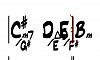
C#m7/G# Dmaj9/E E/F# | Bm
de Perú
Administrator
I think the default font is easier to read than the handwriting font.Originally Posted by josecarlosmaral

I also prefer - instead of m
If I were writing that bar, I’d use D Δ/E to keep the 9 from tangling up with the following chord and using the alternate chord field, I’d place D Δ9 above. (for reading) I’d also make the two adjacent chords small using S/N
S and N (Small/Normal chord-font size)
https://www.irealb.com/forums/showth...al-chord-font)
If there was enough available space in the page, I might consider making it an 8-space bar.
Tap the image for a better look
 Posting Permissions

 Reply With Quote
Bookmarks